Natural language presents a special challenge for data visualization, because it is so complicated. The best visualizations simplify story by focusing on one or two words, as we saw with the line graph of “I” and “we” by age in Section 4.1. Another option for simplifying the story is to group words together into an overarching category, as we saw with the visualizations of “positive emotions” in Chapter 3. Such simplifications make better stories, but sometimes concessions must be made to the complexity of language. Viewers want to see all the words at once.
Normally, showing information about thousands of categories at the same time would be terribly confusing. But words are different, because everyone is an expert in natural language. The average native English speaker knows tens of thousands of words, along with nuanced associations between them (Hellman, 2011). This means that, with the right presentation, viewers can quickly take in many words and notice stories on their own.
Because visualizing words can be so foreign to those not familiar with natural language processing, we offer an brief tutorial on two methods: frequency/frequency plots and word clouds. Though we focus on words here, both of these methods can be applied to other types of tokens (see Chapter 13). Likewise, we focus here on frequency ratios as an intuitive metric for group comparisons. Nevertheless, these methods can be applied to more advanced metrics for comparing groups, as we will see in Section 15.2.
In this tutorial, we will visualize data from Buechel et al. (2018, see Section 4.2.1 and Section 4.2.4), in which participants rated their distress after reading various news stories, and described their thoughts in their own words. The distress ratings were then binned into two groups, allowing us to compare the content of “distressed” texts to that of “non-distressed” texts.
#> # A tibble: 6 × 3
#>   essay                                                    distress distress_bin
#>   <chr>                                                       <dbl>        <dbl>
#> 1 it is really diheartening to read about these immigrant…     4.38            1
#> 2 the phone lines from the suicide prevention line surged…     4.88            1
#> 3 no matter what your heritage, you should be able to ser…     3.5             0
#> 4 it is frightening to learn about all these shark attack…     5.25            1
#> 5 the eldest generation of russians aren't being treated …     4.62            1
#> 6 middle east is fucked up, I've honestly never heard of …     3.12            0
After some preprocessing, we begin with a dataframe in which each word has a row, with three variables:
distressed_count is the number of times the word appears in texts by distressed authors.
nondistressed_count is the number of times the word appears in texts by non-distressed authors.
distressed_freq_ratio is equal to distressed_count/nondistressed_count, or “How many times more common is this word in distressed texts than in non-distressed ones?”
The dataset has been filtered to only include “stop words” (covered in Chapter 16), words that we wouldn’t expect to be associated with the topic of the text.
#> # A tibble: 6 × 4
#>   word  distressed_count nondistressed_count distressed_freq_ratio
#>   <chr>            <int>               <int>                 <dbl>
#> 1 the               3297                2985                 1.10
#> 2 to                2556                2415                 1.06
#> 3 and               2125                1856                 1.14
#> 4 of                1592                1416                 1.12
#> 5 i                 1587                1874                 0.847
#> 6 a                 1547                1603                 0.965
5.1 Frequency/Frequency Plots
A scatterplot is the most obvious choice for visualizing the relationship between two variables. For text data, this approach is commonly associated with the scattertext Python library (Kessler, 2017), but the same effect is easily accomplished in ggplot2.
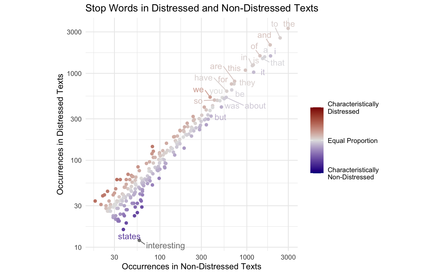
Since we are comparing frequency in one group to frequency in another, we can put each frequency variable on an axis. We will call this a frequency/frequency plot, or F/F plot. To emphasize words that are more frequent in one group than in the other, we represent the ratio between the two frequencies with a diverging color scale.
library(ggrepel)set.seed(2023)distressed_texts_binary|>ggplot(aes(nondistressed_count, distressed_count, label =word, color =distressed_freq_ratio))+geom_point()+geom_text_repel(max.overlaps =20)+scale_x_continuous(trans ="log10", n.breaks =5)+scale_y_continuous(trans ="log10", n.breaks =6)+scale_color_gradient2( low ="blue4", mid ="#E2E2E2", high ="red4", trans ="log2", # log scale for ratios limits =c(.25, 4), breaks =c(.25, 1, 4), labels =c("Characteristically\nNon-Distressed","Equal Proportion","Characteristically\nDistressed"))+labs( title ="Stop Words in Distressed and Non-Distressed Texts", x ="Occurrences in Non-Distressed Texts", y ="Occurrences in Distressed Texts", color ="")+coord_fixed()+theme_minimal()
This plot has the advantage of showing not just which words are characteristic of one group or the other, but also which are more common in both.
To allow viewers to explore these patterns in greater detail, we can make the plot interactive using the ggiraph package. Hover over the points to show the words they represent!
library(ggiraph, verbose =FALSE)library(ggrepel)set.seed(2023)p<-distressed_texts_binary|>ggplot(aes(nondistressed_count, distressed_count, label =word, color =distressed_freq_ratio, tooltip =word, data_id =word# aesthetics for interactivity))+geom_point_interactive()+geom_text_repel_interactive()+scale_x_continuous(trans ="log10", n.breaks =5)+scale_y_continuous(trans ="log10", n.breaks =6)+scale_color_gradient2( low ="blue4", mid ="#E2E2E2", high ="red4", trans ="log2", # log scale for ratios limits =c(.25, 4), breaks =c(.25, 1, 4), labels =c("Characteristically\nNon-Distressed","Equal Proportion","Characteristically\nDistressed"))+labs( title ="Stop Words in Distressed and Non-Distressed Texts", x ="Occurrences in Non-Distressed Texts", y ="Occurrences in Distressed Texts", color ="")+# fixed coordinates since x and y use the same unitscoord_fixed()+theme_minimal()girafe_options(girafe(ggobj =p),opts_tooltip(css ="font-family:sans-serif;font-size:1em;color:Black;"))
5.1.1 Rotated Frequency/Frequency Plots
A disadvantage of simple F/F plots: When people see a scatterplot, they think, “Aha! A correlation!” Any two samples of text in the same language will have highly correlated word frequencies. This boring story about the correlation is distracting from the more interesting stories about words that are especially characteristic of one group or another. This distraction can be removed by “rotating” the axes. Mathematically, we achieve this by plotting the average of the two frequencies (nondistressed_count + distressed_count)/2 on the y axis, and the ratio between the two frequencies on the x axis. The result is a much more intuitive plot with a clear binary comparison. Remember, sometimes you have to do something complicated to make something simple (Section 4.1).
library(ggiraph, verbose =FALSE)library(ggrepel)set.seed(2023)p1<-distressed_texts_binary|>mutate(common =(nondistressed_count+distressed_count)/2)|>ggplot(aes(distressed_freq_ratio, common, label =word, color =distressed_freq_ratio, tooltip =word, data_id =word# aesthetics for interactivity))+geom_point_interactive()+geom_text_repel_interactive()+scale_y_continuous(trans ="log2", breaks =~.x, minor_breaks =~2^(seq(0,log2(.x[2]))), labels =c("Rare", "Common"))+scale_x_continuous(trans ="log2", limits =c(1/6,6), breaks =c(.25, 1, 4), labels =c("Characteristically\nNon-Distressed","Equal Proportion","Characteristically\nDistressed"))+scale_color_gradient2(low ="blue4", mid ="#E2E2E2", high ="red4", trans ="log2", # log scale for ratios guide ="none")+labs(title ="Stop Words in Distressed and Non-Distressed Texts", x ="", y ="Average Frequency", color ="")+theme_minimal()girafe_options(girafe(ggobj =p1),opts_tooltip(css ="font-family:sans-serif;font-size:1em;color:Black;"))
Because we love these rotated F/F plots so much, we couldn’t help showing off one more example, this time with data from the Corpus of Contemporary American English (Davies, 2009):
# get frequency datahttr::GET("https://www.wordfrequency.info/files/genres_sample.xls",httr::write_disk(tf<-tempfile(fileext =".xls")))
p2<-word_freqs|>filter(ACADEMIC!=0, SPOKEN!=0)|># generate tooltip textmutate(rep =if_else(ACADEMIC/SPOKEN>1, "more common in academic texts","more common in spoken texts"), mult =if_else(ACADEMIC/SPOKEN>1, as.character(round(ACADEMIC/SPOKEN, 2)),as.character(round(SPOKEN/ACADEMIC, 2))), tooltip =paste0("<b>",lemma, "</b>", "<br/>", mult, "x ", rep))|>ggplot(aes(ACADEMIC/SPOKEN, (ACADEMIC+SPOKEN)/2, label =lemma, color =ACADEMIC/SPOKEN, tooltip =tooltip, data_id =lemma# aesthetics for interactivity))+geom_point_interactive()+scale_x_continuous(trans ="log2", breaks =c(1/100, 1, 100), labels =c("Characteristically\nSpoken","Equal Proportion","Characteristically\nAcademic"))+scale_y_continuous(trans ="log2", breaks =~.x, minor_breaks =~2^(seq(0, log2(.x[2]))), labels =c("Rare", "Common"))+scale_color_gradientn(limits =c(1/740, 740), colors =c("#023903", "#318232","#E2E2E2", "#9B59A7","#492050"), trans ="log2", # log scale for ratios guide ="none")+labs(title ="Academic vs. Spoken English", x ="", y ="", color ="")+theme_minimal()girafe_options(girafe(ggobj =p2),opts_tooltip(css ="font-family:sans-serif;font-size:1em;color:Black;"))
This is a particularly good visualization, because it tells an interesting story. The story it tells is: “Academic English is very different from spoken English.” The wide aspect ratio and the tooltip text with “#x more common in spoken/academic texts” especially emphasize this point. The F/F plot is an appropriate visualization method because this story pertains to the full distribution of words—look at how many are more than 10 times more common in one or the other!
5.1.2 Advanced Frequency/Frequency Plots
For more information about frequency/frequency plots and other related plot types incorporating various statistics, see the scattertext tutorial(Kessler, 2017). While the tutorial is intended for the scattertext library in Python, almost all examples can be produced in R with ggplot2 and ggiraph. Search bars and other types of responsive interactivity can be accomplished with shiny.
Advantages of Frequency/Frequency Plots
Spatial Mapping: F/F plots use axes, which make it easy to compare values of different words.
Readability: The layout of F/F plots is easy to interpret, especially when rotated and properly labeled.
Full Picture: F/F plots convey the full shape of the frequency distribution, rather than singling out words most characteristic of one side or the other. This can be useful when the distribution itself is interesting.
Disadvantages of Frequency/Frequency Plots
Interactivity Required: F/F plots require interactivity to be maximally informative.
Messy: Without interactivity, labels can be messy and confusing.
Implies that Correlation is Interesting: F/F plots may imply that the point of the graph is to show the correlation between frequencies in the two texts. Rotating the axes mostly solves this problem.
Vague: By showing many words at the same time, F/F plots make it difficult to focus in on particular stories (unless the story is about the distribution itself).
5.2 Word Clouds
Word clouds are commonly used for purposes like:
Summarizing text using word frequencies
Decorating placemats at cheap restaurants
Comparing word usage in two groups of texts
Correlating word usage with a construct of interest
Word clouds are not a good tool for summarizing text. They are a perfectly fine tool for kitschy placemats, but those are beyond the scope of this textbook. In the world of data science, there are only two legitimate uses for word clouds: comparing words across two groups of texts, and correlating word frequencies with a construct of interest. Even these legitimate uses break a fundamental rule of data visualization, since by showing many words at the same time they are telling many stories at the same time, each distracting from the others. Nevertheless, analyses often include so many words (or other units of text) that producing a visualization for each one is unfeasible, and a summary graphic is necessary.
5.2.1 Word Clouds for Comparing Two Groups
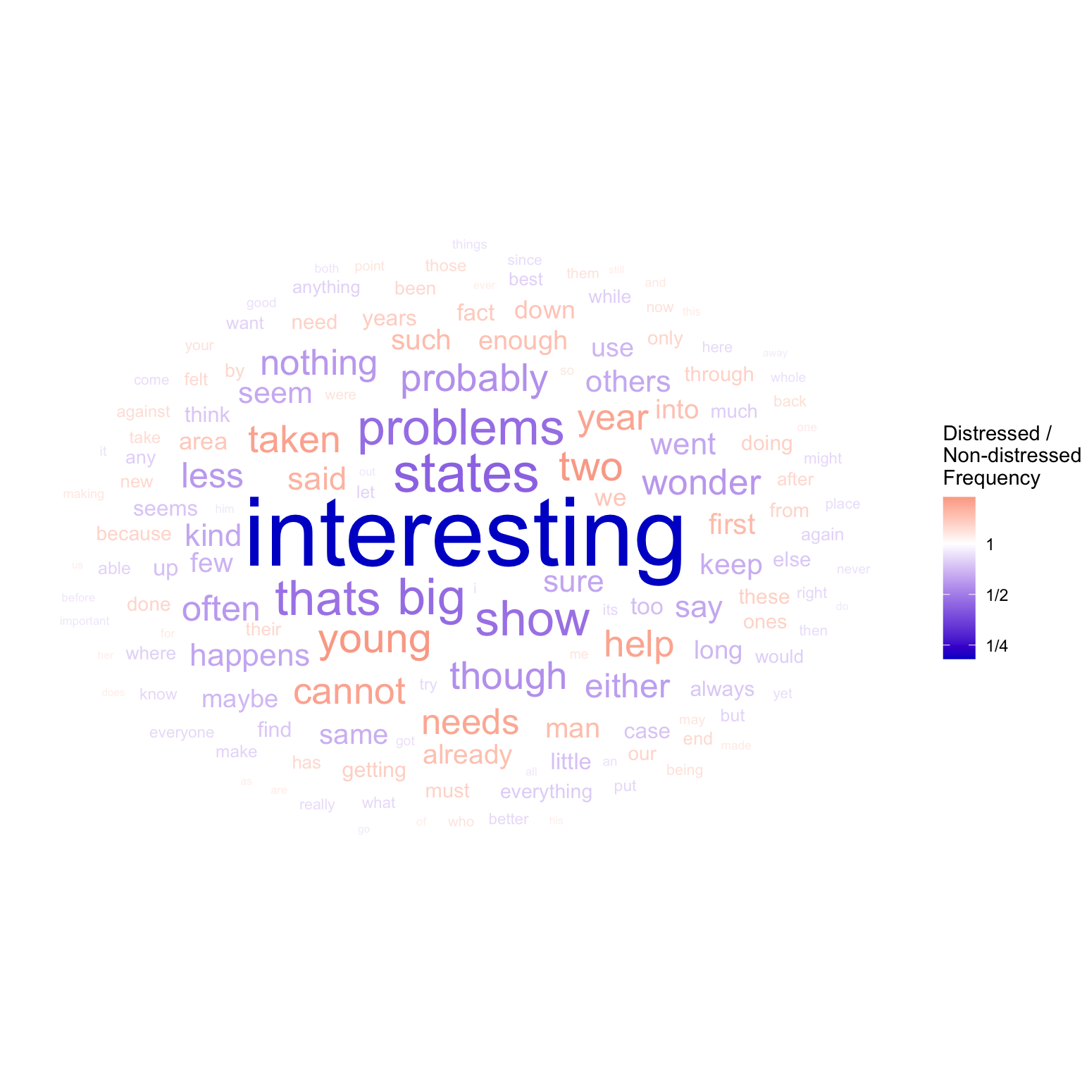
Word clouds generally have three aesthetics: label, color, and size:
label will always be the text of the words.
color is appropriate for representing relative frequency, since it has a neutral center (where the frequencies in both groups are the same and distressed_freq_ratio = 1. Such a neutral center calls for a diverging color scale (Section 4.2.3). Because we are representing the ratio of two frequencies, it is appropriate to use a log scale (see Section 4.2.1). This will make the scale symmetrical for values above and below the neutral center.
size is technically unnecessary, since the diverging color scale already represents both the valence and the magnitude of the relative frequency. In practice though, we are generally most interested in the largest differences. Size is therefore used to emphasize words with greater a discrepancy between the groups. This magnitude value is calculated as abs(log2(distressed_freq_ratio)).
#> # A tibble: 6 × 5
#>   word  distressed_count nondistressed_count distressed_freq_ratio
#>   <chr>            <int>               <int>                 <dbl>
#> 1 the               3297                2985                 1.10
#> 2 to                2556                2415                 1.06
#> 3 and               2125                1856                 1.14
#> 4 of                1592                1416                 1.12
#> 5 i                 1587                1874                 0.847
#> 6 a                 1547                1603                 0.965
#> # ℹ 1 more variable: freq_ratio_log_magnitude <dbl>
For creating word clouds in R we use the ggwordcloud package, with its geom_text_wordcloud geom:
library(ggwordcloud)set.seed(2)distressed_texts_binary|># top 100 highest discrepancy wordsarrange(desc(freq_ratio_log_magnitude))|>slice_head(n =150)|># plotggplot(aes(label =word, size =freq_ratio_log_magnitude, color =distressed_freq_ratio))+geom_text_wordcloud(show.legend =TRUE)+# wordcloud geomscale_radius(range =c(2, 18), guide ="none")+# control text sizescale_color_gradient2( name ="Distressed /\nNon-distressed\nFrequency", labels =~MASS::fractions(.x), # show legend labels as fractions low ="blue3", mid ="white", high ="red3", # set diverging color scale trans ="log2"# log scale)+theme_void()# blank background
We can now easily see that the word most representative of non-distressed texts is “interesting”, which is far more representative of one group than any other word in the analysis.
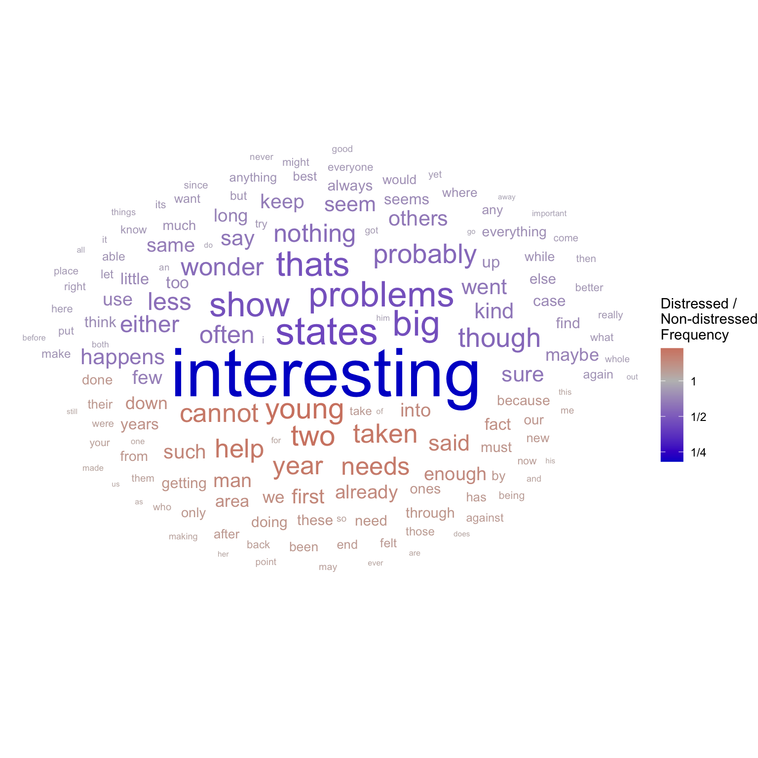
The angle_group aesthetic can be used to separate out the words more frequent in distressed texts from those more frequent in non-distressed texts:
set.seed(2)distressed_texts_binary|># top 150 highest discrepancy wordsarrange(desc(freq_ratio_log_magnitude))|>slice_head(n =150)|># plotggplot(aes(label =word, size =freq_ratio_log_magnitude, color =distressed_freq_ratio, angle_group =distressed_freq_ratio>1))+geom_text_wordcloud(show.legend =TRUE)+# wordcloud geomscale_radius(range =c(2, 18), guide ="none")+# control text sizescale_color_gradient2( name ="Distressed /\nNon-distressed\nFrequency", labels =~MASS::fractions(.x), # show legend labels as fractions low ="blue3", mid ="grey", high ="red3", # set diverging color scale trans ="log2"# log scale)+theme_void()# blank background
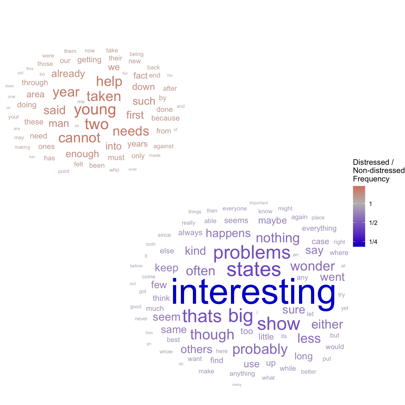
Alternatively, we can specify an original position for each label (as x and y aesthetics) to create multiple clouds:
set.seed(2)distressed_texts_binary|># top 100 highest discrepancy wordsarrange(desc(freq_ratio_log_magnitude))|>slice_head(n =150)|># plotggplot(aes(label =word, size =freq_ratio_log_magnitude, color =distressed_freq_ratio, x =distressed_freq_ratio<1, y =distressed_freq_ratio>1))+# wordcloud geomgeom_text_wordcloud(show.legend =TRUE)+# control text sizescale_radius(range =c(2, 18), guide ="none")+scale_color_gradient2( name ="Distressed /\nNon-distressed\nFrequency",# show legend labels as fractions labels =~MASS::fractions(.x), # set diverging color scale low ="blue3", mid ="grey", high ="red3", # log scale trans ="log2")+theme_void()# blank background
5.2.2 Word Clouds for Continuous Variables of Interest
Recently, some have advocated using correlation coefficients instead of frequency ratios in word clouds. This approach has three advantages:
Correlation coefficients take variance into account.
Since correlation coefficients are more commonly used, it is easier to perform significance testing on them. This way we can include only significant results in the visualization.
Unlike frequency ratios, which always compare two groups, correlation coefficients can be applied to continuous variables of interest.
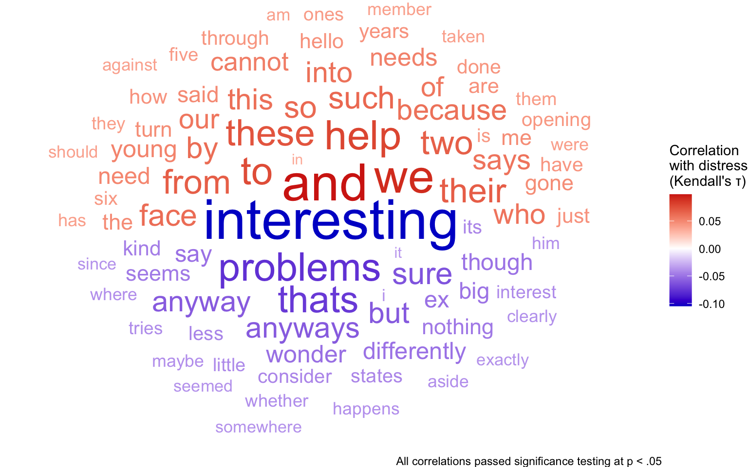
To apply this method to the data from Buechel et al. (2018), we can use participants’ continuous distress ratings for each text. We count the occurrences of each word in each text, and measure the correlation between these frequency variables and the corresponding distress ratings. Since the association may be non-linear, we use the Kendall rank correlation. You can see the full calculations by pressing the “View Source” button at the bottom of this page.
We can now map the strength of the correlation (i.e. abs(cor)) to size, and use color to show the direction of the correlation.
#> # A tibble: 6 × 2
#>   word      cor
#>   <chr>   <dbl>
#> 1 and    0.0983
#> 2 from   0.0680
#> 3 how    0.0448
#> 4 is     0.0422
#> 5 it    -0.0354
#> 6 me     0.0473
set.seed(2)distress_cor|>arrange(desc(abs(cor)))|>ggplot(aes(label =word, color =cor, size =abs(cor), angle_group =cor<0))+geom_text_wordcloud(eccentricity =1.2, show.legend =TRUE)+scale_radius(range =c(4, 15), guide ="none")+labs(caption ="All correlations passed significance testing at p < .05")+scale_color_gradient2( name ="Correlation\nwith distress\n(Kendall's τ)", low ="blue3", mid ="white", high ="red3", # set diverging color scale)+theme_void()
“Interesting” is still the most highly correlated word, indicating lack of distress, but now we can see that “and” and “we” are highly indicative of distress. The assurance that all correlations passed significance testing makes for a particularly convincing graphic.
5.2.3 Advanced Word Clouds
For more information about how word clouds are generated and how to customize them, see Pennec (2023). Be careful though - any customization of your word clouds should be in the service of communicating information effectively.
Advantages of Word Clouds
To the Point: Word clouds emphasize words most characteristic of the variable of interest.
No Interactivity Required: Word clouds show many words at once without requiring interactivity.
Looks Fancy
Disadvantages of Word Clouds
Hard to Interpret Proportions: Size and color aesthetics make it extremely difficult to compare values of different words (e.g. Is x twice as blue as y?).
Vague: By showing many words at the same time, word clouds make it difficult to focus in on particular stories.
Press the “View Source” button below to see the hidden code blocks in this chapter.
Buechel, S., Buffone, A., Slaff, B., Ungar, L. H., & Sedoc, J. (2018). Modeling empathy and distress in reaction to news stories. CoRR, abs/1808.10399. http://arxiv.org/abs/1808.10399
Davies, M. (2009). The 385+ million word corpus of contemporary american english (1990―2008+): Design, architecture, and linguistic insights. International Journal of Corpus Linguistics, 14, 159–190. https://www.english-corpora.org//coca/
Hellman, A. B. (2011). Vocabulary size and depth of word knowledge in adult-onset second language acquisition. International Journal of Applied Linguistics, 21(2), 162–182.