In Chapter 14, we used a preexisting list of surprise-related words to test whether true autobiographical stories are more surprise-related than imagined stories. Sometimes though, it can be informative to take a theory-free approach to the difference between two groups. We might ask: How are the words used in true autobiographical stories different from the words used in imagined stories? We call the investigation of questions like this open vocabulary analyses, a term coined by Schwartz et al. (2013).
Both open vocabulary analyses and dictionary-based methods use word counts, but they come from opposite directions: Dictionary-based methods start with a construct and use it to examine the difference between groups (or levels of a continuous variable). The open vocabulary approach, on the other hand, starts with the difference between groups (or levels of a continuous variable) and generates a list of words that can then be identified with one or more constructs after the fact.
Open vocabulary analyses are useful for three types of applications:
Open vocabulary analyses are sometimes a good second step in EDA, after looking at your data directly (see Chapter 11). If you are planning an analysis of token counts (e.g. using dictionary-based methods), open vocabulary analyses are a good way to look for overall patterns in the way that tokens are distributed across your groups, or to look for individual tokens that are particularly representative of one group or another.
When training a machine learning model on token counts (Section 16.7), you will need to decide which variables (AKA features) to include in the model. You can use an open vocabulary approach to find the tokens that carry the most information about your outcome variable.
Open vocabulary analyses can be a final product! In some cases, researchers want to characterize difference between the language use of two groups, without being constrained by particular dictionaries. Schwartz et al. (2013) provide many elegant examples of this approach.
15.1 Frequency Ratios
The most intuitive way to compare texts from two groups is one we already explored in the context of data visualization in Chapter 5: frequency ratios. To get frequency ratios from a Quanteda DFM, we can use the textstat_frequency() function from the quanteda.textstats package, with the groups parameter set to the categorical variable of interest. Let’s compare true stories from fictional ones in the Hippocorpus data.
#>   feature frequency rank docfreq    group
#> 1       i     32080    1    2686 imagined
#> 2     the     25826    2    2742 imagined
#> 3      to     24104    3    2746 imagined
#> 4     and     20847    4    2707 imagined
#> 5       a     16945    5    2714 imagined
#> 6     was     15405    6    2618 imagined
In the resulting dataframe, each row represents one feature within each category. frequency is the number of times the feature appears in the group, rank is the ordering from highest to lowest frequency within each group, and docfreq is the number of documents in the group in which the feature appears at least once. To compare imagined stories to recalled ones, we can calculate frequency ratios.
#> # A tibble: 6 × 6
#>   feature count_imagined count_recalled freq_imagined freq_recalled
#>   <chr>            <dbl>          <dbl>         <dbl>         <dbl>
#> 1 i                32080          32906        0.0475        0.0426
#> 2 the              25826          31517        0.0383        0.0408
#> 3 to               24104          27379        0.0357        0.0354
#> 4 and              20847          26447        0.0309        0.0342
#> 5 a                16945          19850        0.0251        0.0257
#> 6 was              15405          19484        0.0228        0.0252
#> # ℹ 1 more variable: imagined_freq_ratio <dbl>
We can now plot a rotated F/F plot, as in Chapter 5.
library(ggiraph, verbose =FALSE)library(ggrepel)set.seed(2023)p<-imagined_vs_recalled|>mutate(# calculate total frequency common =(freq_imagined+freq_recalled)/2,# remove single quotes (for html) feature =str_replace_all(feature, "'", "`"))|>ggplot(aes(imagined_freq_ratio, common, label =feature, color =imagined_freq_ratio, tooltip =feature, data_id =feature))+geom_point_interactive()+geom_text_repel_interactive(size =2)+scale_y_continuous( trans ="log2", breaks =~.x, minor_breaks =~2^(seq(0, log2(.x[2]))), labels =c("Rare", "Common"))+scale_x_continuous( trans ="log10", limits =c(1/10,10), breaks =c(1/10, 1, 10), labels =c("10x More Common\nin Recalled Stories","Equal Proportion","10x More Common\nin Imagined Stories"))+scale_color_gradientn( colors =c("#023903", "#318232","#E2E2E2", "#9B59A7","#492050"), trans ="log2", # log scale for ratios guide ="none")+labs( title ="Words in Imagined and Recalled Stories", x ="", y ="Total Frequency", color ="")+# fixed coordinates since x and y use the same unitscoord_fixed(ratio =1/8)+theme_minimal()girafe_options(girafe(ggobj =p),opts_tooltip(css ="font-family:sans-serif;font-size:1em;color:Black;"))
This view allows us to explore individual words that are characteristic of one or the other group. It also shows the overall shape of the distribution—the slight skew to the left suggests that recalled stories tend to have a slightly richer vocabulary than imagined ones.
15.2 Keyness
Working with frequency ratios has an intuitive appeal that is perfect for data visualization; “10 times more common in group A than group B” is a statement that anyone can understand. Even so, frequency ratios are statistically misleading, since they do not account for random sampling error. For example, a word that appears 1000 times in group A and 100 times in group B is much more convincingly representative of group A than a word that appears 10 times in group A and 1 time in group B, even though the frequency ratio is identical. Furthermore, simple frequency ratios do not account for base rates—ratios can be skewed to one side simply because texts in one group are longer than those in another. The F/F plot in Section 15.1 solved this problem by working with relative frequencies (the count divided by total words in the group; Section 16.3), but these problems can be solved more elegantly by using statistically motivated methods for group comparisons, sometimes referred to as keyness statistics.
Quanteda’s default keyness statistic is none other than the chi-squared value, which measures how different the two groups are relative to what might be expected by random chance1. We can compute the chi-squared statistic directly from the DFM using the textstat_keyness() function from quanteda.textstats, with the “target” parameter set to one of the two groups of documents, in this case imagined ones, or docvars(imagined_vs_recalled_dfm, "memType") == "imagined". This group is referred to as the target group, while everything else becomes the reference group. The function keeps a token’s chi-squared statistic positive if it is more common than expected in the target group, or flips it to negative if it is less common than expected in the target group. Though chi-squared is the default, we recommend using a likelihood ratio test (measure = "lr") for most applications. This setting produces the G-squared statistic, a close relative of chi-squared. For smaller samples, we recommend Fisher’s exact test (measure = "exact"), which is more reliable for hypothesis testing but takes much longer to compute.
# Filtered DFMimagined_vs_recalled_dfm<-hippocorpus_dfm|># only keep features that appear in at least 30 documentsdfm_trim(min_docfreq =30)|># only keep imagined and recalled stories (not retold)dfm_subset(memType%in%c("imagined", "recalled"))# Calculate Keynessimagined_keyness<-imagined_vs_recalled_dfm|>textstat_keyness(docvars(imagined_vs_recalled_dfm, "memType")=="imagined", measure ="lr")head(imagined_keyness)
We can use Quanteda to generate a simple plot of the most extreme values of our keyness statistic, using the textplot_keyness() function, from the quanteda.textplots package.
imagined_keyness|>quanteda.textplots::textplot_keyness()+labs(title ="Words in Imagined (target) and Recalled (reference) Stories")
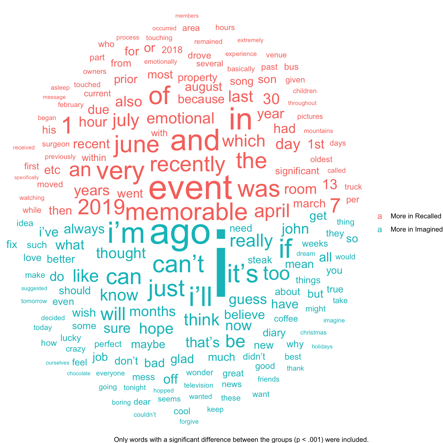
We can also represent the keyness values as a word cloud, as we did for frequency ratios in Chapter 5.
library(ggwordcloud)set.seed(2)imagined_keyness|># only words with significant difference to p < .001filter(p<.001)|># arrange in descending orderarrange(desc(abs(G2)))|># plotggplot(aes(label =feature, size =G2, color =G2>0, angle_group =G2>0))+geom_text_wordcloud_area(eccentricity =1, show.legend =TRUE)+scale_size_area(max_size =30, guide ="none")+scale_color_discrete( name ="", breaks =c(FALSE, TRUE), labels =c("More in Recalled", "More in Imagined"))+labs(caption ="Only words with a significant difference between the groups (p < .001) were included.")+theme_void()# blank background
Keyness plots like this are often a good second step in EDA, after looking at your data directly (see Chapter 11). For an even better chance at noticing interesting patterns, we recommend generating keyness plots for n-grams and shingles in addition to words (see Chapter 13).
15.3 Continuous Covariates
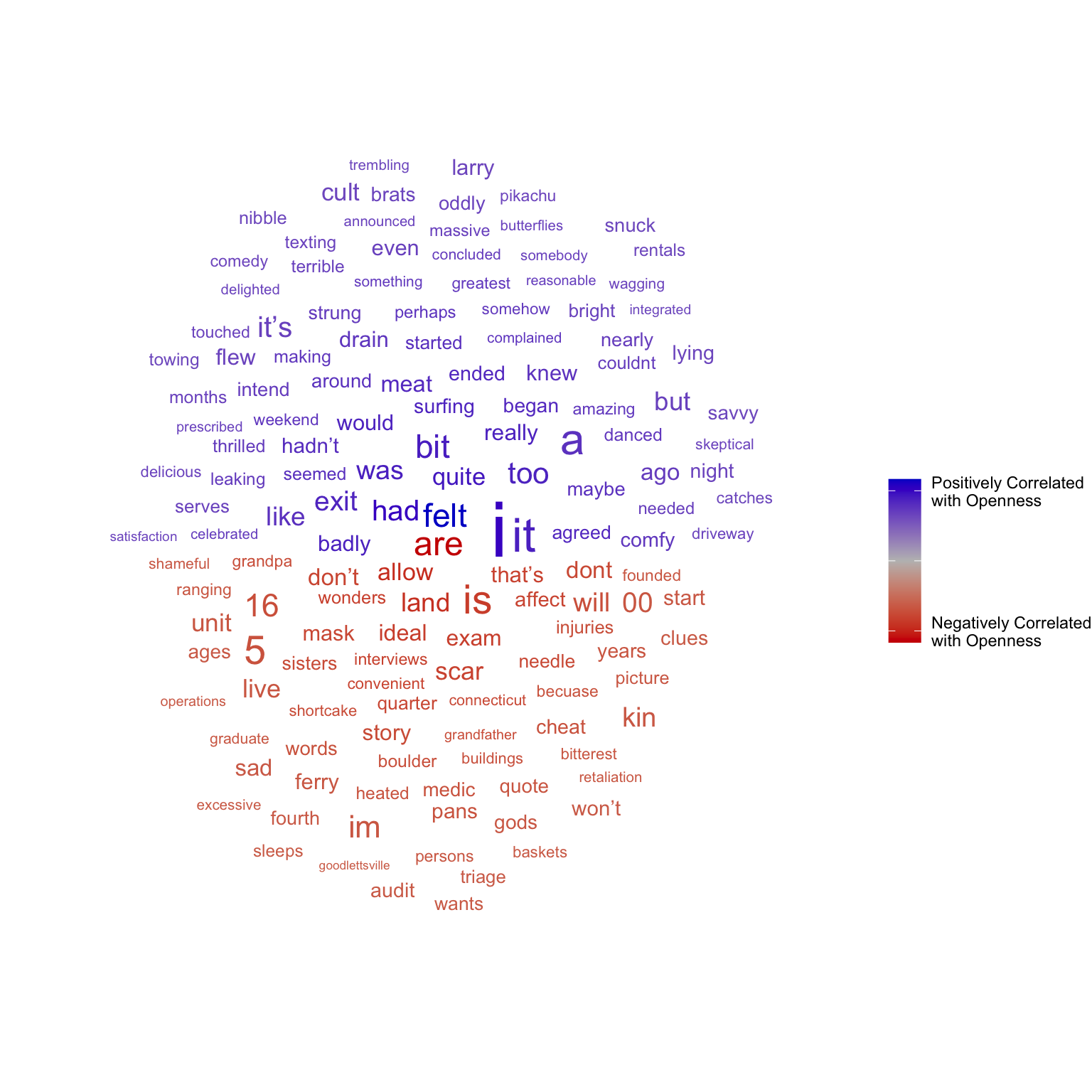
Open vocabulary analysis does not require two distinct groups. For example, we may want to investigate the differences in language associated with openness to experience. A simple way to do this is to measure the correlation between word frequencies in documents and the documents’ authors’ openness score.
# openness score of the author of each documentopenness_scores<-docvars(hippocorpus_corp)$opennesshippocorpus_dfm
#> # A tibble: 6 × 2
#>   feature       cor
#>   <chr>       <dbl>
#> 1 concerts  0.00415
#> 2 are      -0.0583
#> 3 my        0.00717
#> 4 most      0.00482
#> 5 favorite  0.0129
#> 6 thing     0.0195
Now that we have correlation coefficients, we can once again make a word cloud.
set.seed(2)openness_cor|># arrange in descending orderarrange(desc(abs(cor)))|># only top correlating wordsslice_head(n =150)|># plotggplot(aes(label =feature, size =abs(cor), color =cor, angle_group =cor<0))+geom_text_wordcloud_area(eccentricity =1, show.legend =TRUE)+scale_size_area(max_size =10, guide ="none")+scale_color_gradient2( name ="", low ="red3", mid ="grey", high ="blue3", breaks =c(-.05, 0, .05), labels =c("Negatively Correlated\nwith Openness", "","Positively Correlated\nwith Openness"))+theme_void()# blank background
15.4 Generating Dictionaries With Open Vocabulary Analysis
In Section 14.6 we saw that dictionaries for word counting can be generated in many ways. One of these ways is to start with a corpus and proceed with open vocabulary analysis. As an example, let’s use the Crowdflower Emotion in Text dataset to generate a new dictionary for the emotion of surprise. The Crowdflower dataset includes 40,000 Twitter posts, each labeled with one of 13 sentiments. Of these, 2187 are labeled as reflecting surprise.
glimpse(crowdflower)
#> Rows: 40,000
#> Columns: 4
#> $ tweet_id  <dbl> 1956967341, 1956967666, 1956967696, 1956967789, 1956968416, …
#> $ sentiment <chr> "empty", "sadness", "sadness", "enthusiasm", "neutral", "wor…
#> $ author    <chr> "xoshayzers", "wannamama", "coolfunky", "czareaquino", "xkil…
#> $ text      <chr> "@tiffanylue i know  i was listenin to bad habit earlier and…
Generating a dictionary is a subtly different goal than discovering the differences between groups. In Section 15.2 above, we recommended the likelihood ratio test as a way of looking for statistically significant differences. When generating a dictionary though, we care less about statistical significance and more about information—if I observe this word in a text, how much does it tell me about the text? For this kind of question, we recommend a different keyness statistic: pointwise mutual information (PMI).
PMI can be computed just like the likelihood ratio test, using textstat_keyness(). We will need to be careful though, since PMI is sensitive to rare tokens—if a token appears only once in the corpus, in a text labelled surprise, it will be identified as giving lots of information about whether the text is labeled surprise. This is true enough within our training corpus, but with such a small sample size, the appearance of a rare token in a text is probably due to random variation. Rare tokens are therefore unlikely to generalize to other data sets when we use them in a dictionary. So we’ll want to keep tokens with a high PMI, but remove very rare ones.
# convert to corpuscrowdflower_corp<-crowdflower|>corpus(docid_field ="tweet_id")# convert to DFMcrowdflower_dfm<-crowdflower_corp|>tokens(remove_punct =TRUE)|>tokens_ngrams(n =c(1L, 2L))|># 1-grams and 2-gramsdfm()# compute PMIsurprise_pmi<-crowdflower_dfm|>textstat_keyness(docvars(crowdflower_dfm, "sentiment")=="surprise", measure ="pmi")# filter out rare words and low PMIsurprise_pmi<-surprise_pmi|>filter(n_target+n_reference>10, pmi>1.5)surprise_pmi
We are left with a list of the unigrams and bigrams that most indicate that a tweet contains surprise. We can now use this list as a dictionary.
tweet_surprise_dict<-dictionary(list(surprise =surprise_pmi$feature), separator ="_"# in n-grams, tokens are separated by "_")
Can we use this new surprise dictionary to test our hypothesis that true autobiographical stories include more surprise than imagined stories? Maybe. There is no guarantee that surprise words in Tweets will be the same as surprise words in autobiographical stories. With this in mind, we can proceed cautiously:
# count wordshippocorpus_surprise_df<-hippocorpus_dfm|>dfm_lookup(tweet_surprise_dict)|># count dictionary wordsconvert("data.frame")|># convert to dataframeright_join(hippocorpus_corp|>convert("data.frame")# convert to dataframe)|>mutate(wc =ntoken(hippocorpus_dfm))# total word count
#> Joining with `by = join_by(doc_id)`
# modeltweet_surprise_mod<-MASS::glm.nb(surprise~memType+log(wc), data =hippocorpus_surprise_df)summary(tweet_surprise_mod)
#>
#> Call:
#> MASS::glm.nb(formula = surprise ~ memType + log(wc), data = hippocorpus_surprise_df,
#>     init.theta = 0.4897427347, link = log)
#>
#> Coefficients:
#>                 Estimate Std. Error z value Pr(>|z|)
#> (Intercept)     -5.24212    0.51985 -10.084  < 2e-16 ***
#> memTyperecalled -0.07517    0.06931  -1.085    0.278
#> memTyperetold    0.05558    0.08335   0.667    0.505
#> log(wc)          0.68752    0.09417   7.301 2.86e-13 ***
#> ---
#> Signif. codes:  0 '***' 0.001 '**' 0.01 '*' 0.05 '.' 0.1 ' ' 1
#>
#> (Dispersion parameter for Negative Binomial(0.4897) family taken to be 1)
#>
#>     Null deviance: 3812.3  on 6853  degrees of freedom
#> Residual deviance: 3757.0  on 6850  degrees of freedom
#> AIC: 8149.5
#>
#> Number of Fisher Scoring iterations: 1
#>
#>
#>               Theta:  0.4897
#>           Std. Err.:  0.0402
#>
#>  2 x log-likelihood:  -8139.4810
Using our dictionary generated from Tweets with open vocabulary analysis, we find no significant difference between true autobiographical stories and imagined stories in the amount of surprise-related language they contain (p = 0.278).
Schwartz, H. A., Eichstaedt, J. C., Kern, M. L., Dziurzynski, L., Ramones, S. M., Agrawal, M., Shah, A., Kosinski, M., Stillwell, D., Seligman, M. E. P., & Ungar, L. H. (2013). Personality, gender, and age in the language of social media: The open-vocabulary approach. PLOS ONE, 8(9), 1–16. https://doi.org/10.1371/journal.pone.0073791
More precisely, the chi-squared statistic is the sum of the differences between observed frequencies and the frequencies that would be expected if there were no difference between the groups, divided by the expected frequency.↩︎